New logo in the works!
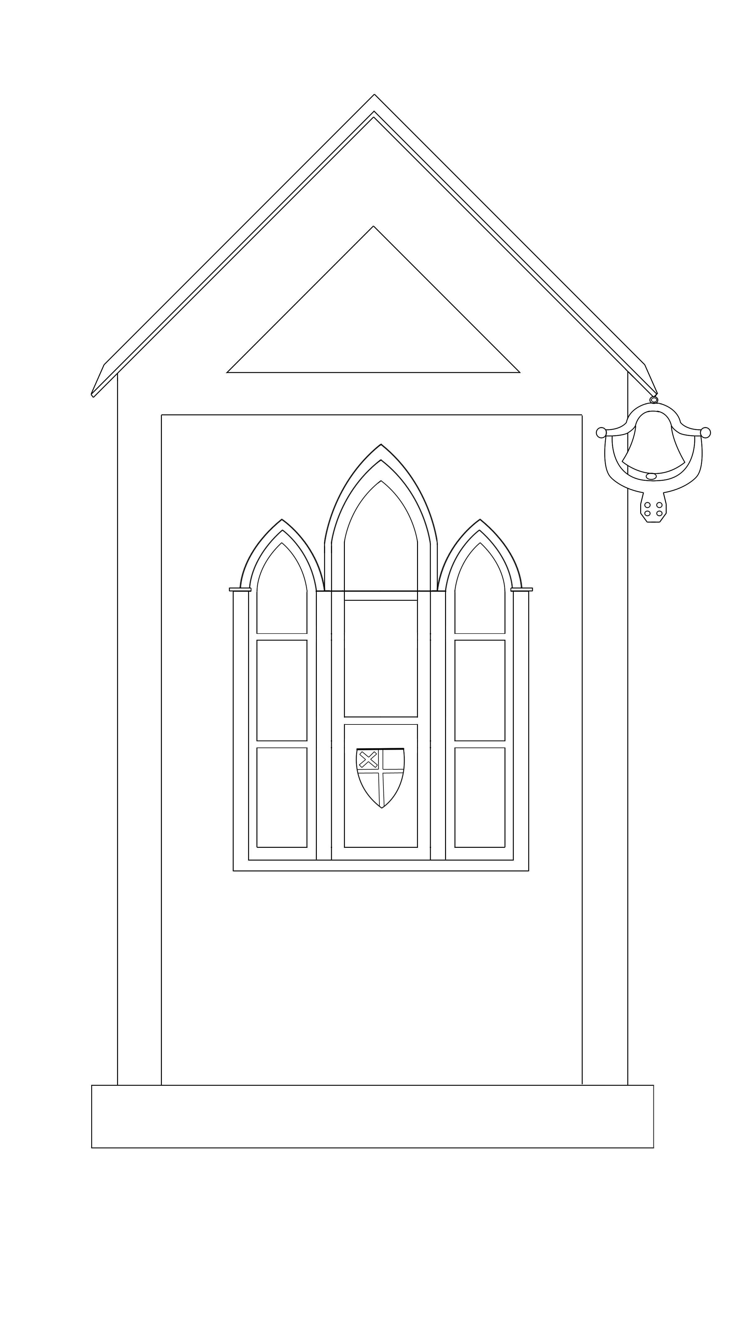
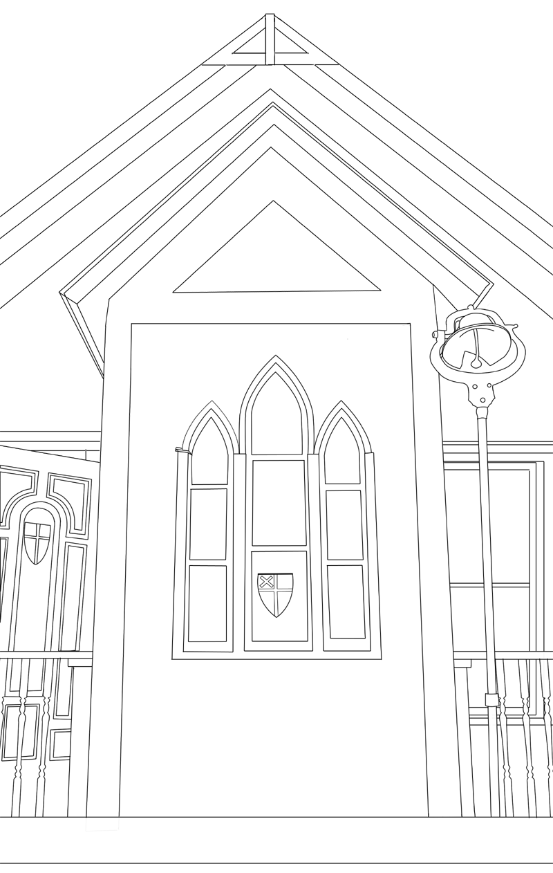
Since starting a new church I thought it was important to come up with a nice logo that we can use for t-shirts, business cards, etc… I loved the original 3 windows in the front when looking at the church so I started with that. I had to modify the bell to hang from the eave rather than stand on a pole for simplicity purposes but I think it turned out well. I will eventually color it in but for now these are just the outlines. I also decided to do a more elaborate logo as well focusing on the entire front of the building as well. This one looks like you are kind of looking up at it but I think it gives it some more depth and I was able to keep the bell on the pole, and include the railings, side of the building, etc… I am also planning on coloring this one in as well but it will require a lot more detail. I figure that this is one that we can use on the back of a shirt or for something more intricate.
 I also decided to do a more elaborate logo as well focusing on the entire front of the building as well. This one looks like you are kind of looking up at it but I think it gives it some more depth and I was able to keep the bell on the pole, and include the railings, side of the building, etc… I am also planning on coloring this one in as well but it will require a lot more detail. I figure that this is one that we can use on the back of a shirt or for something more intricate.
Please let me know what you think in the comments section so I know what you all like, what you may want to change, etc.
— Jeromy

